Creating icon sets that look great everywhere can be a challenge. Design need to be clear, simple, and easy to understand no matter the size or device. A great way to start is by using a vectorizer tool by Creative Fabrica to turn your drawings or images into clean vector shapes. Vector icons are perfect because they keep their quality even when scaled up or down.
When designing icons, you want them to be recognizable and consistent. Each icon in your set should feel like it belongs with the others, using similar shapes, line weights, and styles. This helps users quickly understand what the design means and makes your design look professional.
Another important point is to focus on simplicity. Simple shapes and clear lines work best. Avoid adding too much detail because small details can get lost when designs are small. The goal is to communicate the idea quickly and clearly.
Lastly, test your icons at different sizes and on different backgrounds. What looks good big might be unclear small, and vice versa. Make sure your designs stay sharp and easy to read in all situations.
Table of Contents
ToggleUse Vector Graphics to Keep Your Icons Sharp
Vector graphics are key when making icons that work anywhere. Unlike pixel images, vectors use lines and shapes to create art. This means you can make your designs larger or smaller without losing quality.
“SVG stands for Scalable Vector Graphics. This format allows for the storage of vector-based designs, meaning images are made of vectors rather than pixels. These images are scalable, so you can resize them without losing any quality.” – as Aida González Vázquez explains.
When you create your icons as vectors, you ensure they will look perfect on screens of all sizes—from tiny phone screens to large desktop monitors. You can also easily edit vector designs, changing colors or shapes without making the image blurry.
Many design programs support vector files, and online tools like the mentioned vectorizer can help turn your hand-drawn or pixel-based images into vectors. This makes your icon design process smoother and more flexible.
Using vector graphics also helps with file size. Vector files are usually smaller than high-resolution images, which means your icons load faster on websites and apps. This improves the user experience and saves bandwidth.
Keep Your Icons Simple and Clear
When designing icons, less is more. Simple designs are easier to understand and recognize, especially when they are small. Start by focusing on the main shape that represents the idea of your icon. Avoid extra decorations or too many lines.

Using basic shapes like circles, squares, and triangles can help you build clear designs. You want to make sure the main message of the icon comes through quickly. For example, a phone icon should look like a phone even at a small size.
Make sure the lines and strokes you use are not too thin. Thin lines can disappear or look broken on some screens, especially when icons are small. Try to keep a consistent line thickness across all icons in the set for harmony.
Color can also help make your icons clear, but keep it simple. Use one or two colors maximum, and make sure the colors have enough contrast with the background. This makes your designs visible for everyone, including people with vision difficulties.
Test Your Icons in Different Sizes and Contexts
After you design your icons, testing is a crucial step. Icons often appear in many sizes and on different backgrounds, so they must work everywhere.
First, look at your icons in very small sizes, like 16×16 or 24×24 pixels. This is how many icons appear on phones or toolbars. If the icon loses its shape or looks confusing, simplify it more.
Next, check your icons in larger sizes. Sometimes designs look too empty or strange when blown up. Adjust the shapes or add small details if needed, but keep them balanced.
Try placing your icon on light and dark backgrounds. Sometimes an icon can disappear if the colors are too similar to the background. Consider adding a border or shadow if your icon needs to stand out.
Finally, see how your designs look next to text or other images. They should complement other design elements without overpowering or being ignored. Testing in real contexts helps ensure your icons perform well everywhere.
Practical Tips for Consistent Icon Sets
Here are some simple tips to keep your icon sets consistent and professional:
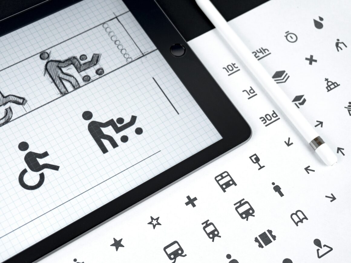
- Use a grid system to align all designs. This helps keep sizes and proportions uniform.
- Pick one style and stick to it: outline, filled, or flat. Mixing styles can confuse users.
- Choose a limited color palette. Too many colors can distract and reduce clarity.
- Keep corner radius consistent—if you round corners on one icon, do it for all.
- Use the same stroke width for all lines to create balance and harmony.
Following these tips will help your icon looks like a team, making your design easier to use and more pleasing to the eye.Final Thoughts
Designing icon sets that work anywhere takes practice and care. Using vector graphics is one of the best ways to ensure your designs stay crisp and clear at all sizes. Keep your designs simple, test them in real situations, and maintain consistency across your set.
Remember, an icon is a powerful way to communicate quickly. Good icons guide users and improve their experience. Take your time to make icons that are both beautiful and useful.

If you want to start turning your ideas into sharp vector designs, try a vectorizer. It can make the process easier and help you create icons that look perfect on any screen.


